
Fortune 200 Global Retailer - Modernizing a Licensee Portal [NDA]
I led UX Strategy & Research to port a retailer's licensed-store portal from Sharepoint to Salesforce Experience Cloud. The Retailer's team wanted a 'lift and shift' with minor improvements without talking to users. I pushed for user research, gaining executive buy-in.
Several licensee store visits, observational interviews, and testing with 37 participants later, I produced a data-driven and usability-validated licensed store portal. Testing resulted in 8 out of 11 tasks averaging over 90% completion rate and users called the experience "easy" 17 times in unprompted open feedback, without any training.
I led UX Strategy & Research to port a retailer's licensed-store portal from Sharepoint to Salesforce Experience Cloud. The Retailer's team wanted a 'lift and shift' with minor improvements without talking to users. I pushed for user research, gaining executive buy-in.
Several licensee store visits, observational interviews, and testing with 37 participants later, I produced a data-driven and usability-validated licensed store portal. Testing resulted in 8 out of 11 tasks averaging over 90% completion rate and users called the experience "easy" 17 times in unprompted open feedback, without any training.
Retail
Retail
B2B2C SaaS
B2B2C SaaS
System Modernization
System Modernization
Experience Cloud
Experience Cloud
Scenario
My Role
UX Lead - Research, Design & Strategy
UX Lead - Research, Design & Strategy
Client
Fortune 200 Global F&B Retailer
Fortune 200 Global F&B Retailer
Engagement Length
5 months
5 months
My Deliverables
Personas • Heuristic Evaluation • Sitemap Redesign & Information Architecture • Low to Med-fidelity prototypes • Moderated & Unmoderated Usability Tests • Solution Blueprint (prioritized UX roadmap)
Personas • Heuristic Evaluation • Sitemap Redesign & Information Architecture • Low to Med-fidelity prototypes • Moderated & Unmoderated Usability Tests • Solution Blueprint (prioritized UX roadmap)
A resource intranet that required staff to teach people how to use it
The Retailer's licensed-store operators relied on an intranet site for weekly updates, promotional materials, training resources, and operating manuals. The Retailer's own internal documentation described the site as difficult to navigate, poorly organized, reliant on internal jargon, and dependent on the Retailer's own District Managers to teach new licensee staff how to find anything in it. A separate, unrelated site handled ordering and supplies. Neither had been designed with dedicated UX involvement.
At kickoff, the engagement was framed around a pre-sales proposal, scoped before the Salesforce Experience Services team joined the project. The stated goal was to merge the Retailer's separate, poorly-rated resource intranet into their existing CRM/community platform to create a single, unified Licensee Portal, with early stakeholder interviews planned to validate direction.
What the initial scope did not include was direct research with the licensees—the primary end-users. I raised this as a risk early in the engagement and negotiated two scope changes: adding on-site, observational interviews with licensee staff (not just internal stakeholders and partners), and securing usability testing so the medium-fidelity conceptual prototype could be tested directly with external licensee users through an unmoderated online panel, rather than only with internal staff.
***NDA Case Study: Client names, brand identifiers, and proprietary program names have been anonymized throughout in accordance with NDA portfolio guidance.
A resource intranet that required staff to teach people how to use it
The Retailer's licensed-store operators relied on an intranet site for weekly updates, promotional materials, training resources, and operating manuals. The Retailer's own internal documentation described the site as difficult to navigate, poorly organized, reliant on internal jargon, and dependent on the Retailer's own District Managers to teach new licensee staff how to find anything in it. A separate, unrelated site handled ordering and supplies. Neither had been designed with dedicated UX involvement.
At kickoff, the engagement was framed around a pre-sales proposal, scoped before the Salesforce Experience Services team joined the project. The stated goal was to merge the Retailer's separate, poorly-rated resource intranet into their existing CRM/community platform to create a single, unified Licensee Portal, with early stakeholder interviews planned to validate direction.
What the initial scope did not include was direct research with the licensees—the primary end-users. I raised this as a risk early in the engagement and negotiated two scope changes: adding on-site, observational interviews with licensee staff (not just internal stakeholders and partners), and securing usability testing so the medium-fidelity conceptual prototype could be tested directly with external licensee users through an unmoderated online panel, rather than only with internal staff.
***NDA Case Study: Client names, brand identifiers, and proprietary program names have been anonymized throughout in accordance with NDA portfolio guidance.
Scope & Challenges
A site users needed to be taught to use. The Retailer's own documentation stated that District Managers had to manually walk new licensee staff through the intranet, since its navigation and search were not self-explanatory. In fact, DMs also were regularly utilized as a documentation resource when Licensees gave up trying to find anything in the portal, requesting that DMs find, download. and email them important files they couldn't locate themselves.
Fragmented systems. Licensee operators used two disconnected platforms — one for resources and updates, one for ordering and supplies — each on a different underlying system with separate logins.
A scope initially built without end-user input. The project as sold was based on secondhand documentation. Getting user research with actual licensee employees required renegotiating the project's scope after the engagement had already started.
Constraints of the underlying platform. Any redesign needed to work within the capabilities and near-term roadmap of the CRM platform the Retailer had already selected for the rebuild, rather than a from-scratch build.
Scope & Challenges
A site users needed to be taught to use. The Retailer's own documentation stated that District Managers had to manually walk new licensee staff through the intranet, since its navigation and search were not self-explanatory. In fact, DMs also were regularly utilized as a documentation resource when Licensees gave up trying to find anything in the portal, requesting that DMs find, download. and email them important files they couldn't locate themselves.
Fragmented systems. Licensee operators used two disconnected platforms — one for resources and updates, one for ordering and supplies — each on a different underlying system with separate logins.
A scope initially built without end-user input. The project as sold was based on secondhand documentation. Getting user research with actual licensee employees required renegotiating the project's scope after the engagement had already started.
Constraints of the underlying platform. Any redesign needed to work within the capabilities and near-term roadmap of the CRM platform the Retailer had already selected for the rebuild, rather than a from-scratch build.
Scope & Challenges
A site users needed to be taught to use. The Retailer's own documentation stated that District Managers had to manually walk new licensee staff through the intranet, since its navigation and search were not self-explanatory. In fact, DMs also were regularly utilized as a documentation resource when Licensees gave up trying to find anything in the portal, requesting that DMs find, download. and email them important files they couldn't locate themselves.
Fragmented systems. Licensee operators used two disconnected platforms — one for resources and updates, one for ordering and supplies — each on a different underlying system with separate logins.
A scope initially built without end-user input. The project as sold was based on secondhand documentation. Getting user research with actual licensee employees required renegotiating the project's scope after the engagement had already started.
Constraints of the underlying platform. Any redesign needed to work within the capabilities and near-term roadmap of the CRM platform the Retailer had already selected for the rebuild, rather than a from-scratch build.
People Involved
A small, cross-functional project team
I worked alongside a Experience Services Manager and an Experience Cloud solutions architect, who helped us with feasibility and existing cloud build. On the client side, I worked with Retailer stakeholders, their regional leadership and staff who supported licensee stores. User research led us to work directly with licensee-company employees — store managers, directors of operations, and baristas —the primary end-users of the new portal.
MY ROLE: UX Research & Strategy • Heuristic Evaluation • Information Architecture • Prototyping • Usability Testing • Co-Workshop Facilitation • Scope Negotiation.
EXPERIENCE SERVICES MANAGER: My design team colleague and 'other-half' on the project • Managed the engagement and stakeholder coordination.
SOLUTIONS ARCHITECT: Technical feasibility for permission-based content access. Collaborated with us on Experience Cloud feasibility and existing build.
RETAILER STAKEHOLDERS & PARTNERS: Participated in interviews, shared existing documentation and analytics, and took part in the co-creation workshop, and usability testing.
LICENSEE EMPLOYEES: Store managers, directors, and baristas across several licensee companies, who participated in observational interviews, on-site field research, and usability testing.
People Involved
A small, cross-functional project team
I worked alongside a Experience Services Manager and an Experience Cloud solutions architect, who helped us with feasibility and existing cloud build. On the client side, I worked with Retailer stakeholders, their regional leadership and staff who supported licensee stores. User research led us to work directly with licensee-company employees — store managers, directors of operations, and baristas —the primary end-users of the new portal.
MY ROLE: UX Research & Strategy • Heuristic Evaluation • Information Architecture • Prototyping • Usability Testing • Co-Workshop Facilitation • Scope Negotiation.
EXPERIENCE SERVICES MANAGER: My design team colleague and 'other-half' on the project • Managed the engagement and stakeholder coordination.
SOLUTIONS ARCHITECT: Technical feasibility for permission-based content access. Collaborated with us on Experience Cloud feasibility and existing build.
RETAILER STAKEHOLDERS & PARTNERS: Participated in interviews, shared existing documentation and analytics, and took part in the co-creation workshop, and usability testing.
LICENSEE EMPLOYEES: Store managers, directors, and baristas across several licensee companies, who participated in observational interviews, on-site field research, and usability testing.
People Involved
A small, cross-functional project team
I worked alongside a Experience Services Manager and an Experience Cloud solutions architect, who helped us with feasibility and existing cloud build. On the client side, I worked with Retailer stakeholders, their regional leadership and staff who supported licensee stores. User research led us to work directly with licensee-company employees — store managers, directors of operations, and baristas —the primary end-users of the new portal.
MY ROLE: UX Research & Strategy • Heuristic Evaluation • Information Architecture • Prototyping • Usability Testing • Co-Workshop Facilitation • Scope Negotiation.
EXPERIENCE SERVICES MANAGER: My design team colleague and 'other-half' on the project • Managed the engagement and stakeholder coordination.
SOLUTIONS ARCHITECT: Technical feasibility for permission-based content access. Collaborated with us on Experience Cloud feasibility and existing build.
RETAILER STAKEHOLDERS & PARTNERS: Participated in interviews, shared existing documentation and analytics, and took part in the co-creation workshop, and usability testing.
LICENSEE EMPLOYEES: Store managers, directors, and baristas across several licensee companies, who participated in observational interviews, on-site field research, and usability testing.


Pivotal Work
The project as originally scoped and sold was based on the Retailer's own internal documentation and stakeholder-level interviews, without direct research involving the licensee employees who actually used the systems being redesigned. I identified that gap early in the engagement and negotiated two changes to the project's scope: adding direct interviews and store visits with licensee employees, and securing the testing licenses needed to validate the prototype with those same external users rather than internal staff alone. Without that change, the design decisions in this project would have been based on secondhand complaints and internal assumptions rather than direct evidence from the people the redesign was meant to serve.
The heuristic evaluation, persona definitions, information architecture, and design recommendations in this case study were work I led and produced, informed by that expanded research base and by the co-creation workshop conducted with the client team. The case for expanding the project's research scope, and the research and design direction that followed from it, were mine.
Pivotal Work
The project as originally scoped and sold was based on the Retailer's own internal documentation and stakeholder-level interviews, without direct research involving the licensee employees who actually used the systems being redesigned. I identified that gap early in the engagement and negotiated two changes to the project's scope: adding direct interviews and store visits with licensee employees, and securing the testing licenses needed to validate the prototype with those same external users rather than internal staff alone. Without that change, the design decisions in this project would have been based on secondhand complaints and internal assumptions rather than direct evidence from the people the redesign was meant to serve.
The heuristic evaluation, persona definitions, information architecture, and design recommendations in this case study were work I led and produced, informed by that expanded research base and by the co-creation workshop conducted with the client team. The case for expanding the project's research scope, and the research and design direction that followed from it, were mine.
Pivotal Work
The project as originally scoped and sold was based on the Retailer's own internal documentation and stakeholder-level interviews, without direct research involving the licensee employees who actually used the systems being redesigned. I identified that gap early in the engagement and negotiated two changes to the project's scope: adding direct interviews and store visits with licensee employees, and securing the testing licenses needed to validate the prototype with those same external users rather than internal staff alone. Without that change, the design decisions in this project would have been based on secondhand complaints and internal assumptions rather than direct evidence from the people the redesign was meant to serve.
The heuristic evaluation, persona definitions, information architecture, and design recommendations in this case study were work I led and produced, informed by that expanded research base and by the co-creation workshop conducted with the client team. The case for expanding the project's research scope, and the research and design direction that followed from it, were mine.
Impact
Replaced assumption-based design inputs with direct evidence. The scope change I negotiated meant the final recommendations were data-driven and not solely based on the Retailer's issue list.
Validated the redesign directly with the people who'd use it: 37 usability tests, including 29 with external licensee employees, an average completion rate above 90% on 8 of 11 tasks, and unprompted open-feedback, test participants used the word "easy" 17 times to describe the new portal design.
Reframed a list of surface complaints into addressable causes. The Retailer's own documentation described symptoms (too many clicks, can't find resources); the heuristic evaluation traced those to a smaller set of root causes — inconsistent navigation, unclear labeling, poor information architecture — which is what the redesign was built to fix.
Produced a phased, technically-grounded roadmap/solution blueprint: MVP through future-state releases gave the client a sequenced path to implementation rather than a single, all-at-once redesign proposal.
Impact
Replaced assumption-based design inputs with direct evidence. The scope change I negotiated meant the final recommendations were data-driven and not solely based on the Retailer's issue list.
Validated the redesign directly with the people who'd use it: 37 usability tests, including 29 with external licensee employees, an average completion rate above 90% on 8 of 11 tasks, and unprompted open-feedback, test participants used the word "easy" 17 times to describe the new portal design.
Reframed a list of surface complaints into addressable causes. The Retailer's own documentation described symptoms (too many clicks, can't find resources); the heuristic evaluation traced those to a smaller set of root causes — inconsistent navigation, unclear labeling, poor information architecture — which is what the redesign was built to fix.
Produced a phased, technically-grounded roadmap/solution blueprint: MVP through future-state releases gave the client a sequenced path to implementation rather than a single, all-at-once redesign proposal.
Impact
Replaced assumption-based design inputs with direct evidence. The scope change I negotiated meant the final recommendations were data-driven and not solely based on the Retailer's issue list.
Validated the redesign directly with the people who'd use it: 37 usability tests, including 29 with external licensee employees, an average completion rate above 90% on 8 of 11 tasks, and unprompted open-feedback, test participants used the word "easy" 17 times to describe the new portal design.
Reframed a list of surface complaints into addressable causes. The Retailer's own documentation described symptoms (too many clicks, can't find resources); the heuristic evaluation traced those to a smaller set of root causes — inconsistent navigation, unclear labeling, poor information architecture — which is what the redesign was built to fix.
Produced a phased, technically-grounded roadmap/solution blueprint: MVP through future-state releases gave the client a sequenced path to implementation rather than a single, all-at-once redesign proposal.
Process
Discovery
Interviews, store visits, and a heuristic evaluation of the existing site
I conducted a heuristic evaluation of the existing intranet, documenting specific instances of inconsistent navigation, cluttered layouts, unclear labeling, and broken information architecture — translating the Retailer's general complaints ("hard to navigate," "not organized well") into specific, page-level findings. In parallel, I ran interviews with internal stakeholders and the Retailer's internal field staff, and — after negotiating the scope change — direct interviews and store visits with licensee employees.
29 Total Interviews (5 stakeholders, 7 internal field staff, 17 licensee employees) · 6 Licensee Store Visits · 1 Co-Creation Workshop · 3 Prototype Iterations · 37 Usability Tests (8 moderated, 29 unmoderated)
Root cause, not just symptoms
The Retailer had already identified a list of surface-level complaints about the existing intranet (hard to navigate, can't find resources, too many clicks). My heuristic evaluation and interviews traced those complaints to a smaller set of underlying causes — inconsistent navigation, unclear labeling, and poor information architecture — which is what the design recommendations were built to address, rather than treating each symptom as a separate fix.
Discovery
Interviews, store visits, and a heuristic evaluation of the existing site
I conducted a heuristic evaluation of the existing intranet, documenting specific instances of inconsistent navigation, cluttered layouts, unclear labeling, and broken information architecture — translating the Retailer's general complaints ("hard to navigate," "not organized well") into specific, page-level findings. In parallel, I ran interviews with internal stakeholders and the Retailer's internal field staff, and — after negotiating the scope change — direct interviews and store visits with licensee employees.
29 Total Interviews (5 stakeholders, 7 internal field staff, 17 licensee employees) · 6 Licensee Store Visits · 1 Co-Creation Workshop · 3 Prototype Iterations · 37 Usability Tests (8 moderated, 29 unmoderated)
Root cause, not just symptoms
The Retailer had already identified a list of surface-level complaints about the existing intranet (hard to navigate, can't find resources, too many clicks). My heuristic evaluation and interviews traced those complaints to a smaller set of underlying causes — inconsistent navigation, unclear labeling, and poor information architecture — which is what the design recommendations were built to address, rather than treating each symptom as a separate fix.
Discovery
Interviews, store visits, and a heuristic evaluation of the existing site
I conducted a heuristic evaluation of the existing intranet, documenting specific instances of inconsistent navigation, cluttered layouts, unclear labeling, and broken information architecture — translating the Retailer's general complaints ("hard to navigate," "not organized well") into specific, page-level findings. In parallel, I ran interviews with internal stakeholders and the Retailer's internal field staff, and — after negotiating the scope change — direct interviews and store visits with licensee employees.
29 Total Interviews (5 stakeholders, 7 internal field staff, 17 licensee employees) · 6 Licensee Store Visits · 1 Co-Creation Workshop · 3 Prototype Iterations · 37 Usability Tests (8 moderated, 29 unmoderated)
Root cause, not just symptoms
The Retailer had already identified a list of surface-level complaints about the existing intranet (hard to navigate, can't find resources, too many clicks). My heuristic evaluation and interviews traced those complaints to a smaller set of underlying causes — inconsistent navigation, unclear labeling, and poor information architecture — which is what the design recommendations were built to address, rather than treating each symptom as a separate fix.
29
Interviews
29
Interviews
1
Co-Create Workshops
1
Co-Create Workshops
7
On-Site Research
7
On-Site Research
1
Heuristic Evaluations
1
Heuristic Evaluations
1
Heuristic Evaluations
30
Jobs-To-Be-Done
30
Jobs-To-Be-Done
30
Jobs-To-Be-Done
37
Usability Tests
37
Usability Tests
37
Usability Tests
9
Presentations
9
Presentations
9
Presentations
Definition
Personas built from usage data, not assumptions
Rather than defining personas purely from interview impressions, I cross-referenced them against the existing platform's own usage analytics — one month of session data showed roughly 96% of all site sessions came from licensee (external) users and about 4.6% from the Retailer's internal field staff, with a small number of role types (store-level employee, store manager/director, corporate-level licensee user) accounting for nearly all licensee usage. That data shaped which persona to treat as primary for design decisions: the store-level manager, who had limited computer time and relied heavily on the site's search function once navigation failed them.
Personas by Usage Analytics: Primary and secondary user types defined by combining interview findings with actual session-level usage data.
Current-State Sitemap: A full map of the existing site's navigation and content structure, marking redundant, unused, or misplaced sections.
Proposed Simplified Navigation: A restructured information architecture consolidating the site's many navigation sections into three primary categories, removing links the current-state sitemap review identified as redundant or unused.
Definition
Personas built from usage data, not assumptions
Rather than defining personas purely from interview impressions, I cross-referenced them against the existing platform's own usage analytics — one month of session data showed roughly 96% of all site sessions came from licensee (external) users and about 4.6% from the Retailer's internal field staff, with a small number of role types (store-level employee, store manager/director, corporate-level licensee user) accounting for nearly all licensee usage. That data shaped which persona to treat as primary for design decisions: the store-level manager, who had limited computer time and relied heavily on the site's search function once navigation failed them.
Personas by Usage Analytics: Primary and secondary user types defined by combining interview findings with actual session-level usage data.
Current-State Sitemap: A full map of the existing site's navigation and content structure, marking redundant, unused, or misplaced sections.
Proposed Simplified Navigation: A restructured information architecture consolidating the site's many navigation sections into three primary categories, removing links the current-state sitemap review identified as redundant or unused.
Definition
Personas built from usage data, not assumptions
Rather than defining personas purely from interview impressions, I cross-referenced them against the existing platform's own usage analytics — one month of session data showed roughly 96% of all site sessions came from licensee (external) users and about 4.6% from the Retailer's internal field staff, with a small number of role types (store-level employee, store manager/director, corporate-level licensee user) accounting for nearly all licensee usage. That data shaped which persona to treat as primary for design decisions: the store-level manager, who had limited computer time and relied heavily on the site's search function once navigation failed them.
Personas by Usage Analytics: Primary and secondary user types defined by combining interview findings with actual session-level usage data.
Current-State Sitemap: A full map of the existing site's navigation and content structure, marking redundant, unused, or misplaced sections.
Proposed Simplified Navigation: A restructured information architecture consolidating the site's many navigation sections into three primary categories, removing links the current-state sitemap review identified as redundant or unused.
Readout
A workshop to align stakeholders on direction before designing
I facilitated a two-day co-creation workshop, bringing together the client team and vendor team to align on goals, success metrics, and risks before moving into concept design. The workshop combined empathy mapping and Jobs-To-Be-Done exercises with rapid ideation (including a Crazy-8s sketching exercise), producing a shared, prioritized set of directions to design toward, rather than my synthesis alone driving the concept direction.
4 Alignment Exercises · 3 Empathy Maps · 30 Jobs-To-Be-Done Statements · 13 Inspiration Demos · 8 Final Sketches
The workshop surfaced a consistent set of needs across roles: being kept informed of urgent updates without having to search for them, seeing relevant next actions on arrival, having clear and current resources available in the moment, and having what's needed physically nearby while working. These became the basis for the design recommendations that followed — a simplified navigation structure, a notifications system, a redesigned search experience, and a dashboard-style landing page.
Readout
A workshop to align stakeholders on direction before designing
I facilitated a two-day co-creation workshop, bringing together the client team and vendor team to align on goals, success metrics, and risks before moving into concept design. The workshop combined empathy mapping and Jobs-To-Be-Done exercises with rapid ideation (including a Crazy-8s sketching exercise), producing a shared, prioritized set of directions to design toward, rather than my synthesis alone driving the concept direction.
4 Alignment Exercises · 3 Empathy Maps · 30 Jobs-To-Be-Done Statements · 13 Inspiration Demos · 8 Final Sketches
The workshop surfaced a consistent set of needs across roles: being kept informed of urgent updates without having to search for them, seeing relevant next actions on arrival, having clear and current resources available in the moment, and having what's needed physically nearby while working. These became the basis for the design recommendations that followed — a simplified navigation structure, a notifications system, a redesigned search experience, and a dashboard-style landing page.
Readout
A workshop to align stakeholders on direction before designing
I facilitated a two-day co-creation workshop, bringing together the client team and vendor team to align on goals, success metrics, and risks before moving into concept design. The workshop combined empathy mapping and Jobs-To-Be-Done exercises with rapid ideation (including a Crazy-8s sketching exercise), producing a shared, prioritized set of directions to design toward, rather than my synthesis alone driving the concept direction.
4 Alignment Exercises · 3 Empathy Maps · 30 Jobs-To-Be-Done Statements · 13 Inspiration Demos · 8 Final Sketches
The workshop surfaced a consistent set of needs across roles: being kept informed of urgent updates without having to search for them, seeing relevant next actions on arrival, having clear and current resources available in the moment, and having what's needed physically nearby while working. These became the basis for the design recommendations that followed — a simplified navigation structure, a notifications system, a redesigned search experience, and a dashboard-style landing page.
Usability Testing
Usability Testing
Testing with the people who actually needed to use the site
Testing the prototype with licensee employees — not just internal Retailer staff — required the scope and testing-license changes I'd negotiated earlier in the engagement. With those in place, I ran a combination of moderated sessions with internal field staff and unmoderated remote testing with licensee employees across multiple companies.
8 moderated usability tests with internal field staff
29 unmoderated usability tests (19 licensee employees, 10 internal field staff)
8 of 11 tasks had a completion rate averaging above 90%
Most participants completed navigation tasks in under a minute without any guidance or training, including participants unfamiliar with the existing site
In open-ended feedback, the word "easy" appeared 17 times, describing the prototype as easy "to use," "to navigate," and "to quickly find what I'm looking for"
"The biggest and most significant benefit [of improving the intranet] would be that [store managers] could spend their time where they're more effective, which is teaching and training...on the floor, hand-in-hand with their people." Licensee Employee, Usability Test Participant
"I like the home page. I like there are only 5 options on top to get you started. Very clean and easy to manipulate. It is NOT overwhelming when you open it." Licensee Employee, Usability Test Participant
Test errors that did occur were traced to specific causes — prototype limitations in the search feature, participants applying assumptions from the old site, and a small number of testing-tool glitches — rather than being attributed generally to "usability problems," which shaped exactly which parts of the design still needed further work heading into the next phase.
Usability Testing
Usability Testing
Testing with the people who actually needed to use the site
Testing the prototype with licensee employees — not just internal Retailer staff — required the scope and testing-license changes I'd negotiated earlier in the engagement. With those in place, I ran a combination of moderated sessions with internal field staff and unmoderated remote testing with licensee employees across multiple companies.
8 moderated usability tests with internal field staff
29 unmoderated usability tests (19 licensee employees, 10 internal field staff)
8 of 11 tasks had a completion rate averaging above 90%
Most participants completed navigation tasks in under a minute without any guidance or training, including participants unfamiliar with the existing site
In open-ended feedback, the word "easy" appeared 17 times, describing the prototype as easy "to use," "to navigate," and "to quickly find what I'm looking for"
"The biggest and most significant benefit [of improving the intranet] would be that [store managers] could spend their time where they're more effective, which is teaching and training...on the floor, hand-in-hand with their people." Licensee Employee, Usability Test Participant
"I like the home page. I like there are only 5 options on top to get you started. Very clean and easy to manipulate. It is NOT overwhelming when you open it." Licensee Employee, Usability Test Participant
Test errors that did occur were traced to specific causes — prototype limitations in the search feature, participants applying assumptions from the old site, and a small number of testing-tool glitches — rather than being attributed generally to "usability problems," which shaped exactly which parts of the design still needed further work heading into the next phase.
Usability Testing
Usability Testing
Testing with the people who actually needed to use the site
Testing the prototype with licensee employees — not just internal Retailer staff — required the scope and testing-license changes I'd negotiated earlier in the engagement. With those in place, I ran a combination of moderated sessions with internal field staff and unmoderated remote testing with licensee employees across multiple companies.
8 moderated usability tests with internal field staff
29 unmoderated usability tests (19 licensee employees, 10 internal field staff)
8 of 11 tasks had a completion rate averaging above 90%
Most participants completed navigation tasks in under a minute without any guidance or training, including participants unfamiliar with the existing site
In open-ended feedback, the word "easy" appeared 17 times, describing the prototype as easy "to use," "to navigate," and "to quickly find what I'm looking for"
"The biggest and most significant benefit [of improving the intranet] would be that [store managers] could spend their time where they're more effective, which is teaching and training...on the floor, hand-in-hand with their people." Licensee Employee, Usability Test Participant
"I like the home page. I like there are only 5 options on top to get you started. Very clean and easy to manipulate. It is NOT overwhelming when you open it." Licensee Employee, Usability Test Participant
Test errors that did occur were traced to specific causes — prototype limitations in the search feature, participants applying assumptions from the old site, and a small number of testing-tool glitches — rather than being attributed generally to "usability problems," which shaped exactly which parts of the design still needed further work heading into the next phase.
Designs
From findings to a phased solution
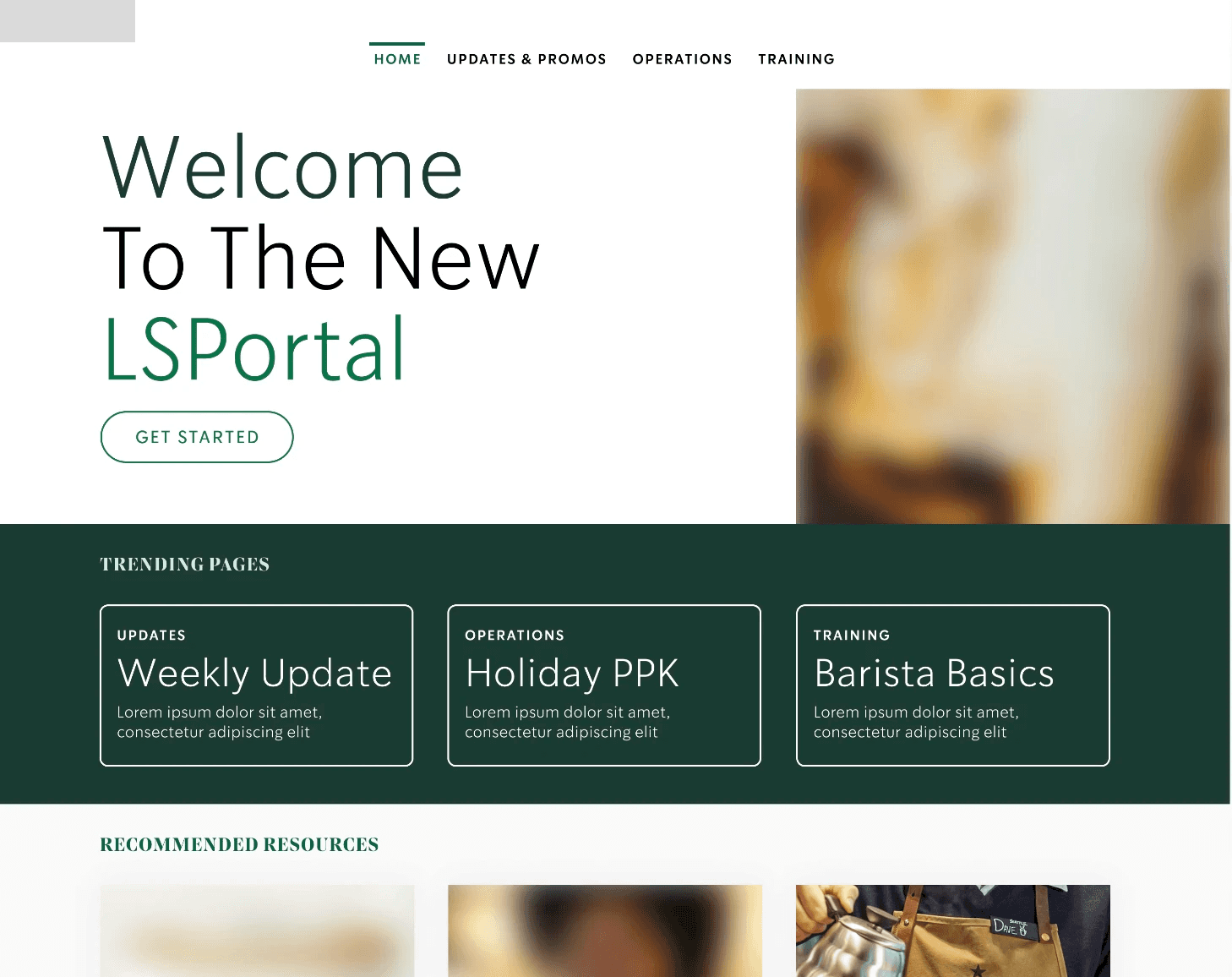
Redesigned Information Architecture. I restructured the existing site's sprawling navigation into three primary sections (Updates & Promos, Operations, Training), with role-based visibility for additional sections (such as ordering tools) shown only to users with the relevant permissions.
Home Page / Dashboard. I designed a landing page combining a simplified top-level navigation, a notifications area for urgent updates, "trending" and "recommended" content modules driven by existing site analytics, and consistent section labeling — replacing a cluttered landing page with unclear, redundant links.
Search, Notifications, Help, and Favorites. I designed a redesigned global search (supporting typo tolerance, sort and filter options, and categorized results), a consolidated notifications center for urgent and non-urgent updates, a relocated and restructured Help section (moved from the page footer into the main navigation), and a "Favorites" feature that tested well with users but was scoped for a later release rather than the initial launch.
Visual Design Templates. I produced visual design templates for the home page, section landing pages, and navigation states (including role-specific views for different user types), to guide implementation once development began.
Solution Blueprint & Phased Roadmap. I compiled the research findings, prototype, and design specifications into a Solution Blueprint, along with a phased technical roadmap (MVP through future-state versions) sequencing which features shipped first based on technical feasibility and user impact.
Designs
From findings to a phased solution
Redesigned Information Architecture. I restructured the existing site's sprawling navigation into three primary sections (Updates & Promos, Operations, Training), with role-based visibility for additional sections (such as ordering tools) shown only to users with the relevant permissions.
Home Page / Dashboard. I designed a landing page combining a simplified top-level navigation, a notifications area for urgent updates, "trending" and "recommended" content modules driven by existing site analytics, and consistent section labeling — replacing a cluttered landing page with unclear, redundant links.
Search, Notifications, Help, and Favorites. I designed a redesigned global search (supporting typo tolerance, sort and filter options, and categorized results), a consolidated notifications center for urgent and non-urgent updates, a relocated and restructured Help section (moved from the page footer into the main navigation), and a "Favorites" feature that tested well with users but was scoped for a later release rather than the initial launch.
Visual Design Templates. I produced visual design templates for the home page, section landing pages, and navigation states (including role-specific views for different user types), to guide implementation once development began.
Solution Blueprint & Phased Roadmap. I compiled the research findings, prototype, and design specifications into a Solution Blueprint, along with a phased technical roadmap (MVP through future-state versions) sequencing which features shipped first based on technical feasibility and user impact.
Designs
From findings to a phased solution
Redesigned Information Architecture. I restructured the existing site's sprawling navigation into three primary sections (Updates & Promos, Operations, Training), with role-based visibility for additional sections (such as ordering tools) shown only to users with the relevant permissions.
Home Page / Dashboard. I designed a landing page combining a simplified top-level navigation, a notifications area for urgent updates, "trending" and "recommended" content modules driven by existing site analytics, and consistent section labeling — replacing a cluttered landing page with unclear, redundant links.
Search, Notifications, Help, and Favorites. I designed a redesigned global search (supporting typo tolerance, sort and filter options, and categorized results), a consolidated notifications center for urgent and non-urgent updates, a relocated and restructured Help section (moved from the page footer into the main navigation), and a "Favorites" feature that tested well with users but was scoped for a later release rather than the initial launch.
Visual Design Templates. I produced visual design templates for the home page, section landing pages, and navigation states (including role-specific views for different user types), to guide implementation once development began.
Solution Blueprint & Phased Roadmap. I compiled the research findings, prototype, and design specifications into a Solution Blueprint, along with a phased technical roadmap (MVP through future-state versions) sequencing which features shipped first based on technical feasibility and user impact.
Outcome
Usage analytics and interview data told a more complete story together. Analytics confirmed which user type made up the overwhelming majority of site traffic; that data, combined with interview findings about their specific frustrations, was what justified prioritizing the Licensee Store Manager over several personas identified by the client on kick-off. with less usage but louder internal advocacy.
Root-causing complaints changes what you design. The Retailer's own list of intranet complaints (too many clicks, can't find things, poor search) could have led to a list of unconnected point-fixes. Tracing them back to a shared set of causes — inconsistent navigation, unclear labeling, poor information architecture — led to a coherent redesign instead.
Design recommendations built for a specific platform still need a phased rollout. Not every tested feature (such as Favorites) made sense for an initial release; the phased roadmap distinguished between what user research validated as valuable and what was realistic to build first.
The engagement closed with an approved solution blueprint and roadmap ready for build. The client assigned a new director to lead up their portal team, who contracted another company to build the portal.
It reinforced a pattern I've seen across every engagement: a user-centered approach — discovery, definition, and data-driven designs — combined with trusted relationships, collaboration, and alignment on the user-centric vision before committing engineering time prevents the costliest kind of rework — the kind that happens after something is already built.
Unfortunately over a year later, I was invited to a call with the client's engineering lead on the portal team. He was disappointed with what had been developed by the partner that replaced Salesforce. What had been built had completely ignored the UX solution blueprint, sitemap, and designs, resulting in a basic lift and shift — resulting in another unusable Licensee portal experience, but this time in Salesforce.
Outcome
Usage analytics and interview data told a more complete story together. Analytics confirmed which user type made up the overwhelming majority of site traffic; that data, combined with interview findings about their specific frustrations, was what justified prioritizing the Licensee Store Manager over several personas identified by the client on kick-off. with less usage but louder internal advocacy.
Root-causing complaints changes what you design. The Retailer's own list of intranet complaints (too many clicks, can't find things, poor search) could have led to a list of unconnected point-fixes. Tracing them back to a shared set of causes — inconsistent navigation, unclear labeling, poor information architecture — led to a coherent redesign instead.
Design recommendations built for a specific platform still need a phased rollout. Not every tested feature (such as Favorites) made sense for an initial release; the phased roadmap distinguished between what user research validated as valuable and what was realistic to build first.
The engagement closed with an approved solution blueprint and roadmap ready for build. The client assigned a new director to lead up their portal team, who contracted another company to build the portal.
It reinforced a pattern I've seen across every engagement: a user-centered approach — discovery, definition, and data-driven designs — combined with trusted relationships, collaboration, and alignment on the user-centric vision before committing engineering time prevents the costliest kind of rework — the kind that happens after something is already built.
Unfortunately over a year later, I was invited to a call with the client's engineering lead on the portal team. He was disappointed with what had been developed by the partner that replaced Salesforce. What had been built had completely ignored the UX solution blueprint, sitemap, and designs, resulting in a basic lift and shift — resulting in another unusable Licensee portal experience, but this time in Salesforce.
Outcome
Usage analytics and interview data told a more complete story together. Analytics confirmed which user type made up the overwhelming majority of site traffic; that data, combined with interview findings about their specific frustrations, was what justified prioritizing the Licensee Store Manager over several personas identified by the client on kick-off. with less usage but louder internal advocacy.
Root-causing complaints changes what you design. The Retailer's own list of intranet complaints (too many clicks, can't find things, poor search) could have led to a list of unconnected point-fixes. Tracing them back to a shared set of causes — inconsistent navigation, unclear labeling, poor information architecture — led to a coherent redesign instead.
Design recommendations built for a specific platform still need a phased rollout. Not every tested feature (such as Favorites) made sense for an initial release; the phased roadmap distinguished between what user research validated as valuable and what was realistic to build first.
The engagement closed with an approved solution blueprint and roadmap ready for build. The client assigned a new director to lead up their portal team, who contracted another company to build the portal.
It reinforced a pattern I've seen across every engagement: a user-centered approach — discovery, definition, and data-driven designs — combined with trusted relationships, collaboration, and alignment on the user-centric vision before committing engineering time prevents the costliest kind of rework — the kind that happens after something is already built.
Unfortunately over a year later, I was invited to a call with the client's engineering lead on the portal team. He was disappointed with what had been developed by the partner that replaced Salesforce. What had been built had completely ignored the UX solution blueprint, sitemap, and designs, resulting in a basic lift and shift — resulting in another unusable Licensee portal experience, but this time in Salesforce.
